Voltage Digital — Digital Marketing Agency Website (7 Pages)
A 7-page website for a digital marketing, growth or creative agency — loud dark-mode design with giant headlines, a scrolling word marquee, magnetic buttons, tilting case-study cards, a services accordion, sample results count-ups, retainer pricing and a project brief form, with ProfessionalService SEO markup.
Preview
What you can customize
Each section below becomes a guided form field in your library after purchase — no prompting experience required.
- 1
Home
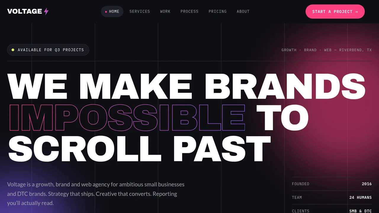
Giant type-only hero with gradient outlined word and availability dot, scrolling word marquee, manifesto, numbered service rows, sample results count-ups, tilting case-study masonry, client wordmark marquee, 4-step process line, client quotes.
2 editable fields
- 2
Services
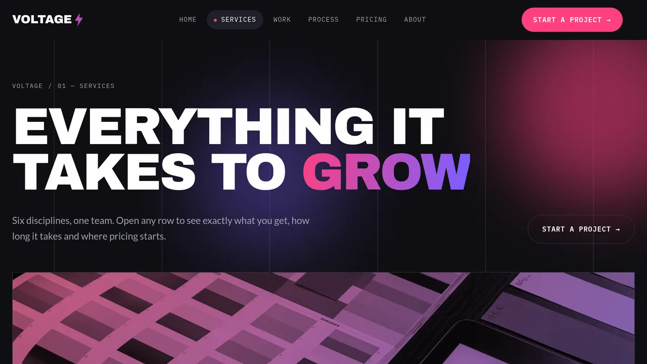
Six numbered accordion rows (brand, paid, SEO, web, email, CRO) with deliverable chips, timelines and starting prices; engagement models; platforms; FAQ.
2 editable fields
- 3
Work
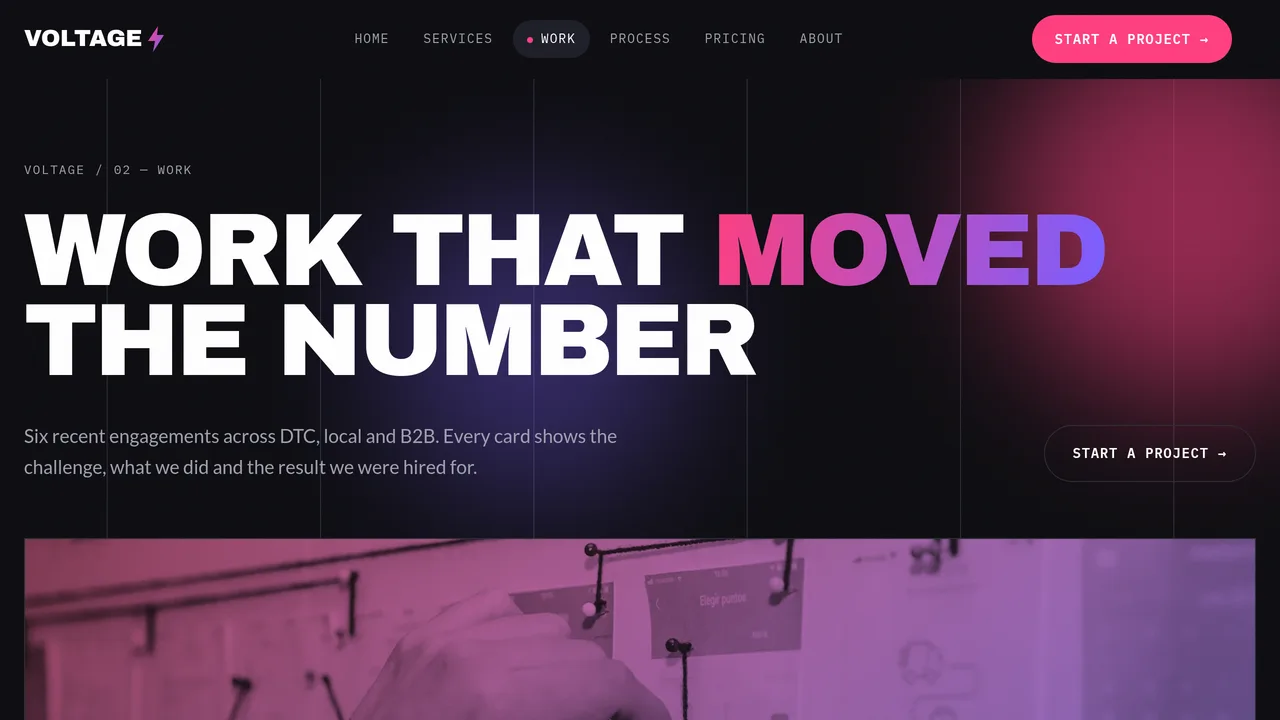
Featured case study with gradient border and count-ups, six tilting challenge/approach/result case cards, wireframe-to-launch slider, client quotes.
2 editable fields
- 4
Process
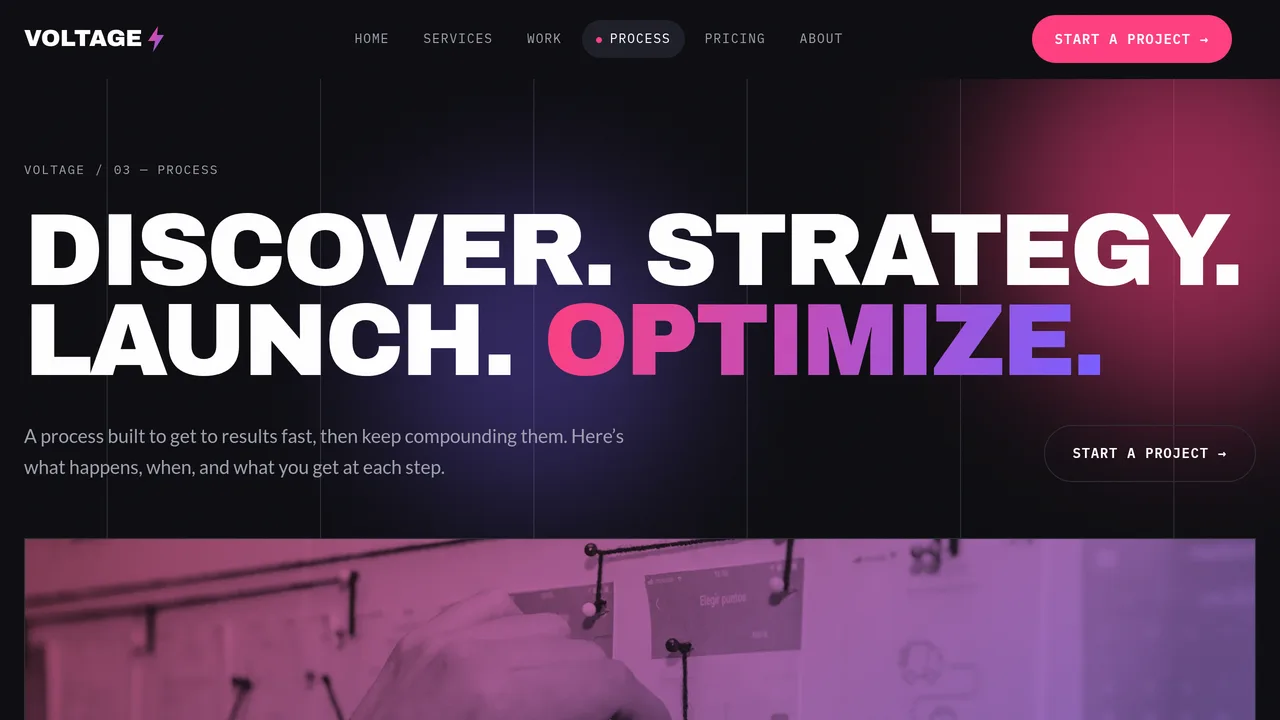
Discover → Strategy → Launch → Optimize timeline that fills on scroll, working rhythm cards, house rules, process FAQ.
2 editable fields
- 5
Pricing
Launch / Growth / Scale monthly retainers, web and brand project price table, where-the-fee-goes meters, pricing FAQ.
2 editable fields
- 6
About
Founder story, culture count-ups, six monogram team cards, values, careers.
2 editable fields
- 7
Start a Project
Project brief form (budget, services checkboxes, timeline, details, referral source), what happens next, good-fit checklist.
2 editable fields
Launching it is simple: download the files, publish it live to your own Vercel account, or push it to your own GitHub — see how to launch your AI Tapz website.
Usage instructions
7 pages, each a complete, self-contained HTML page — a loud, dark-mode digital agency design: enormous Archivo Black uppercase headlines with a gradient-outlined accent word, IBM Plex Mono labels and Lato body, near-black and off-black panels with hot pink, electric violet and a few acid-yellow highlights, sharp corners with 1px hairlines, pill buttons, gradient-bordered featured cards, noise grain, column grid lines and glowing gradient blobs. 1. Home (index.html) — giant headline hero with an availability dot, scrolling word marquee, manifesto, six numbered service rows, sample results count-ups, four tilting case-study cards, client wordmark marquee, four-step process line, client quotes. 2. Services (services.html) — six numbered accordion rows (native details/summary) with deliverable chips, timelines and starting prices; three engagement models; platforms; FAQ. 3. Work (work.html) — featured case study, six case-study cards with challenge / approach / result (CreativeWork markup), wireframe-to-launch before/after slider, six client quotes. 4. Process (process.html) — Discover → Strategy → Launch → Optimize timeline that fills as you scroll, working rhythm, house rules, FAQ. 5. Pricing (pricing.html) — Launch, Growth and Scale monthly retainers, web and brand project price table, where-the-fee-goes meters, pricing FAQ (FAQPage markup). 6. About (about.html) — founder story, culture count-ups, six monogram team cards, values, careers. 7. Start a Project (contact.html) — project brief form, availability, what happens next, good-fit checklist. ANIMATION. Headlines wipe in, the accent words shimmer pink-to-violet, the word and client marquees scroll (hover pauses them), numbers count up (they read the number you type), the process lines fill as you scroll, pricing meters grow, blobs drift and sections slide in. With a mouse or trackpad only, a soft gradient glow follows the cursor in the hero and call-to-action bands, "Start a project" and other pill buttons are magnetic (they drift a few pixels toward the cursor — they stay ordinary links), and case-study cards tilt in 3D. None of the pointer effects run on touch screens or for visitors who ask for reduced motion, and everything is visible without JavaScript. SERVICES ACCORDION. Each service is a native <details> row — no script needed. Edit the number, title, description, timeline, starting price and deliverable chips directly. BEFORE/AFTER SLIDER. The Work page slider is two ordinary images — replace them with your own wireframe and finished-site shots. FONTS. Archivo Black, IBM Plex Mono and Lato load from Google Fonts via @font-face in each page's style block, with system fallbacks. SEO. Each page opens with a labeled block (title, meta description, canonical link, Open Graph tags and JSON-LD — ProfessionalService + Organization on the home page, CollectionPage with Service and CreativeWork parts, FAQPage, AboutPage or ContactPage). Copy it into your real <head> when you deploy, and update the domain, address and services. FORMS. The project brief form posts nowhere — connect it to your CRM or form service before publishing. EDITING. Change colors and fonts site-wide in the editor's Theme panel; edit the header or footer once and use "Apply to all pages"; sections can be moved, duplicated, hidden or deleted; use the Tablet and Mobile views for device-specific tweaks. Client wordmarks in the marquees are plain text — edit or delete them like any other text. CLAIMS & SAMPLE CONTENT. The agency name, address, phone, team, prices, results figures (ROAS, traffic growth, brands launched, ad spend managed), culture stats, case studies, client names and testimonials are fictional samples. Replace them with your own real details and only publish case studies, metrics, client names and quotes you have permission to use. No real brand logos are included — never add a client's logo without written permission. Platform names on the Services page describe channels you run; remove any you are not certified in. IMAGES. All photography is real Unsplash stock, self-hosted under /content-images, shown with a grayscale + pink/violet duotone so it sits in the dark design. Photos show workspaces, screens and hands; the people visible are seen from behind or at a distance, so no photo shows a recognisable face. Team cards use monogram initials, not portraits — swap in real headshots if you like.
Reviews
No reviews yet — be the first once you've used this template.